websites
its one year of freckleskies today
been about four years since i started dabbling in handmaking websites the good old fashioned way. im a little embarrassed to say, back then i didnt really care about understanding and making things myself, and was rather mindless generally. really the only reason i was fighting with html and css was because i couldnt find a free, easy tool like ms frontpage or something. truly got lucky on that front
either way, i know better now. ive grown, and my websites have grown with me
mvrf.cf
(sometime early 2019 - mid 2019)
my first ever proper website. i still look back fondly on it. i used it as a diary of sorts and was riddled with hardcoded absolute alignments. friday nights became a sort of event when id just turn the lights off, have a snack and write whatever bullshit was on my mind. it all feels like those fake deep 2015 instagram posts with the weird brown filter on it but really i was just messing aroun having my fun in this new medium
this screencap is zoomed out a bit so i could fit more in
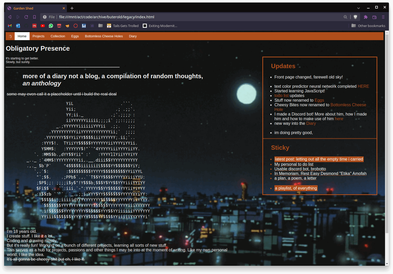
anthology of WHAT bro this is what you were anthologising

my brother in christ no it was not
projects, collection, eggs and bottomless cheese holes were basically "feeds" of posts. it was the only consistent thing in this site. diary led you to a shitty html puzzle that looked like the cover of the life of pablo. you had to click on specific things in a specific order or you got locked out of the diary page (until you refreshed the page again). that or you could just type in the path
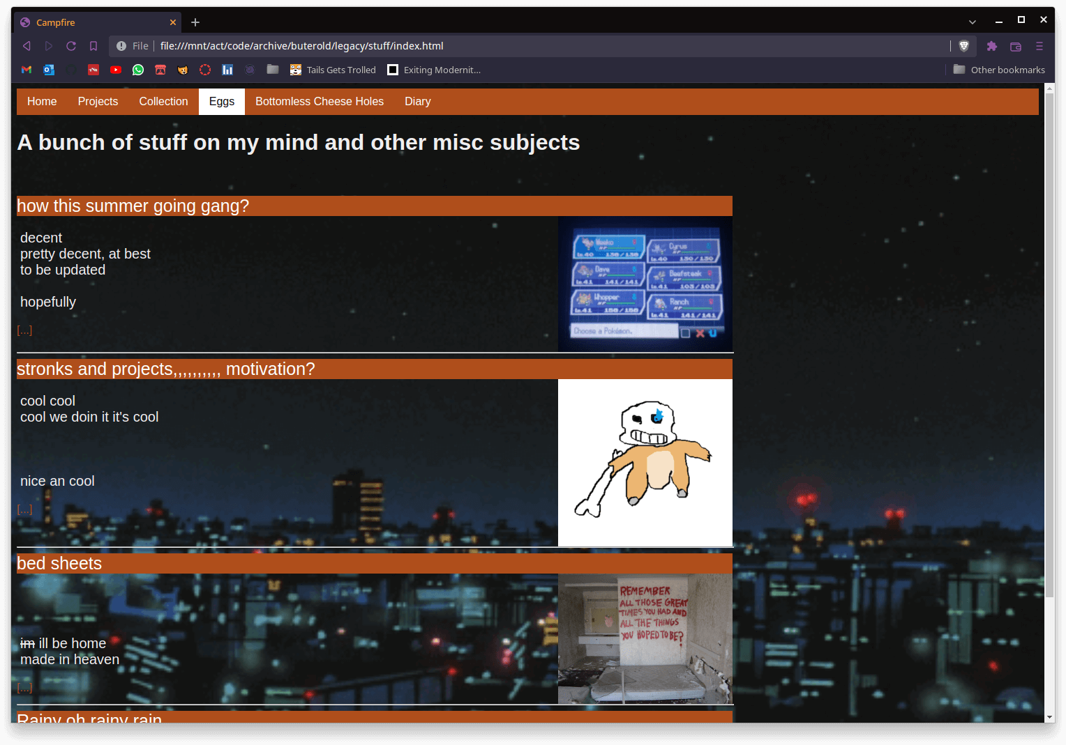
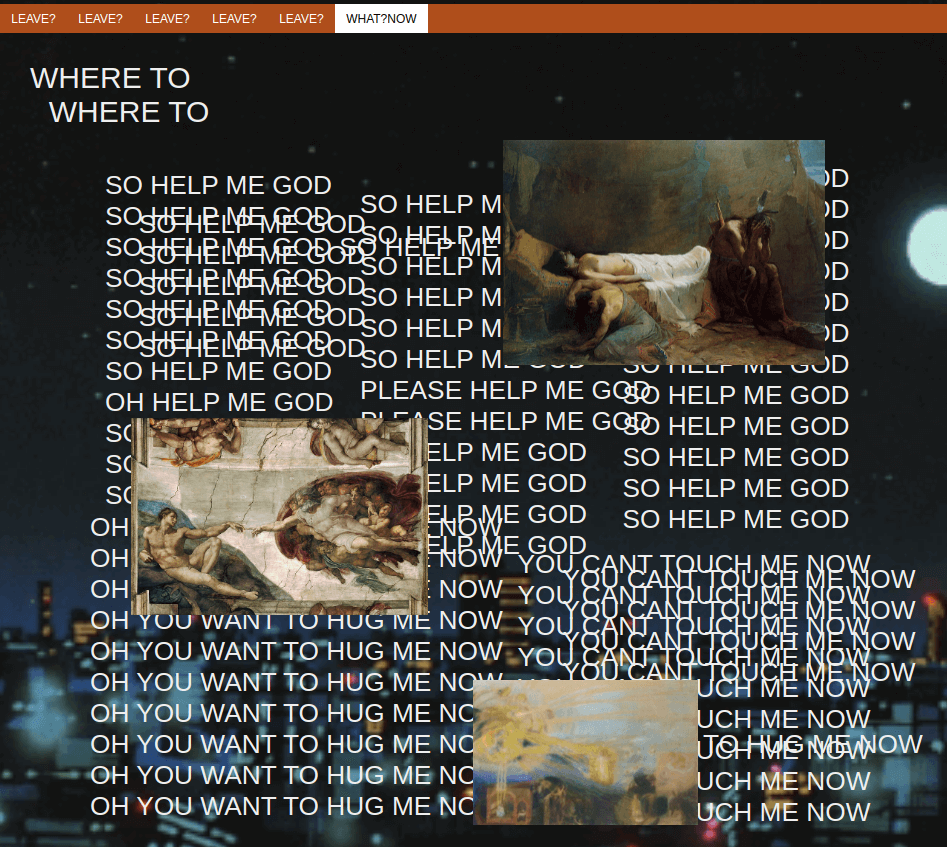
projects and collections are pretty self explainatory. eggs, holes and diary were all kinda the same, just different degrees of it. eggs ended up being random posts. holes was supposed to be me talking about

unfortunately i did not have any back then so it became a lighter version of the diary. the diary i guess can be chalked up to venting. although i dont like the word, i cant come up with a better one either
theres a lot to look through, and its the funnest of them all to do so simply because i had nearly no filter and would spew any and all junk in my mind thinking it was deep and heavy and whatever. i mock it but because i love it. i had my phases and moments of falling from one extreme to the other, and that year was a recovery period id say. it took a while to find the right balance. i still think this was the most soulful of all the websites ive made. trust me, the worst website is yet to come
the :') option thing used to be called sky back when this was the main website. for the following few sites i made, mvrf was still accessible within them, and :') returned you back to the "main" site. sky on the other hand just returned you to the landing page, similar to the sky here in the path on the top left
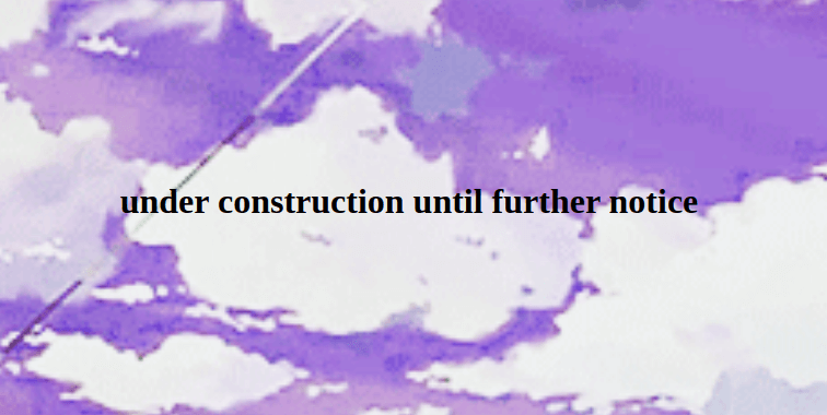
the landing page was quite literally a the pic of a sky with a couple doorways. i no longer have a working version of it but i found this screenshot (left img) in the archives of an old instagram account. i also found this other doorway (right img) which i assume replaced the one on the left
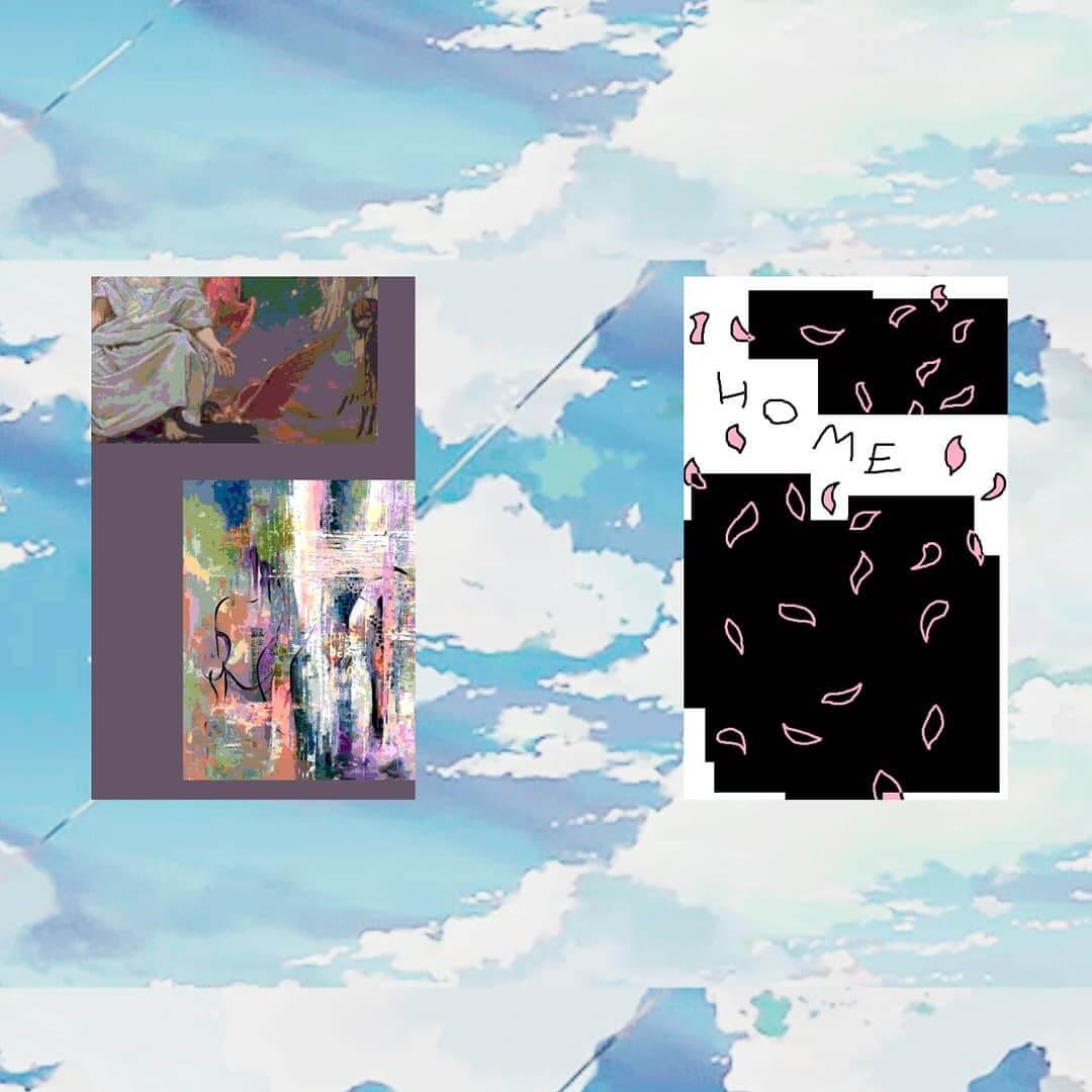
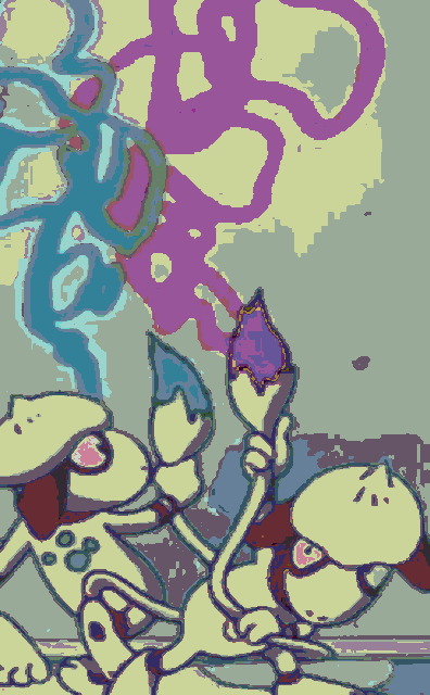
the home doorway led you to the homepage youve seen already. i dont remember what the other doorways led to, probably nothing since i found this page in the files of mvrf
there was also another horizontal doorway which used that angel painting by alexandre cabanel. you know, the one all boys deep philosophers who also follow hypebeast on instagram have as their profile pic at some point. the "i only watch anime ironically or deep cult classics you never wouldve heard of like berserk or flcl" version of the kaneki pfp or any mature eren pfp. yeah you know the one. that was close to the end of me using this website and was supposed to lead to a gallery consisting of just pics of pages from my diary. thank god i didnt follow through with that, but its pretty in theme with the next site
before we move on to the next site theres one last thing id like to point out. the internal structure and organisation of webpages

what is this. why did you number folders of articles. why did you name the index file something else. its not like you didnt know about why theyre called index since some pages are called just index.html. and its not like more html files were in one folder. and while youre naming them weirdly why not just put all posts in one folder instead of making their own??
my heart weeps whenever i see ugly uris
egrilledcheese.ml
(17th aug 2019 - a month later maybe)
we have gathered here today, on this webpage, to jest at this past iteration of myself. the tragedy of a man empty of any substance and character, who watched shows and listened to music for the sole reason of curating an online list, and wrote about himself for others to read. empty on the inside trying to build myself from the outside, clueless of who i was, what i liked and what i wanted. fortunately its been only up from there and im proud to say i overcame all of those issues. honestly that period in my life is the one thing i feel shame for, however its just as much part of my personal history as any other and denying it would invalidate any and all progress ive made from there. the following website is a clear and direct reflection of that period and that iteration of myself
this is the worst thing i have ever made
everything about this website goes against every fiber of my being. we went from most soulful to most soulless in a heartbeat. horrible. i forced myself to overshare and create the absolute safest thing i could come up with. downright abysmal
the photos are from an (also forced) instagram post i made the night i finished the site.

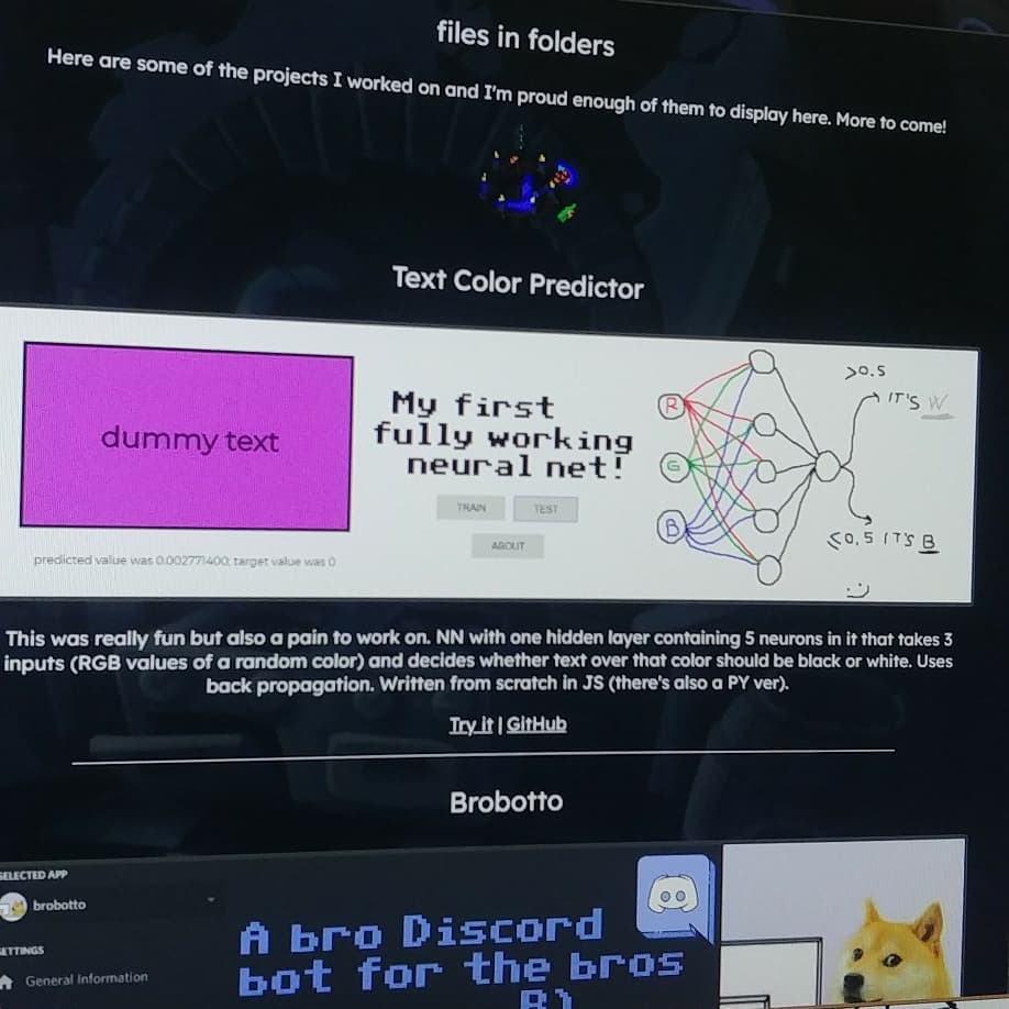
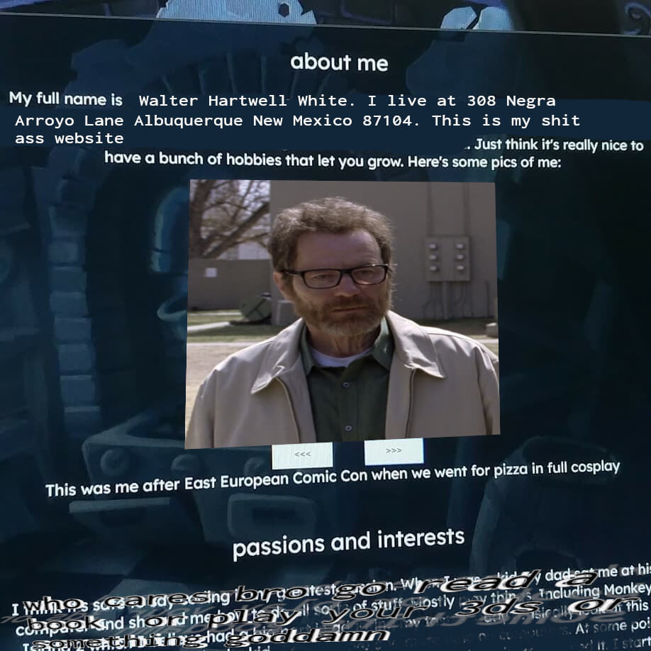
before i say anything else let me also show you the first sentence of the description of said instagram post. first sentence of two pretty longish paragraphs. yeah ...

never have i been so ashamed of anything i have ever done
i was physically exhausted writing this website. squeezing paragraphs upon paragraphs of shit ass pampered info nobody in the world was going to read. what recruiters and employers bro what hurry were you in. who were you trying to convince of what. i think i squeezed it out all in one sitting too, morning til midnight and even later, forcing myself to shit this garbage out. and it shows, its bad because i didnt make it for myself. i was the last person in my mind making this. no real clue who i was making this for, but certainly not me. it was the safest shit you could ever imagine. it even had rounded corners. whens the last time you saw something i made have rounded borders? who even likes this shit stale grey blue color?? soulless. not one drop of character. definitely one of my lowest points, not just website-wise but generally. blue has always been my least liked color
an ocean wide but a puddle deep. struggling to build myself from outside first. im thankful for it though (the period in time not the website, as we established the website sucks). as ive said, from one extreme to the other, learning every corner to better know and plan out your position
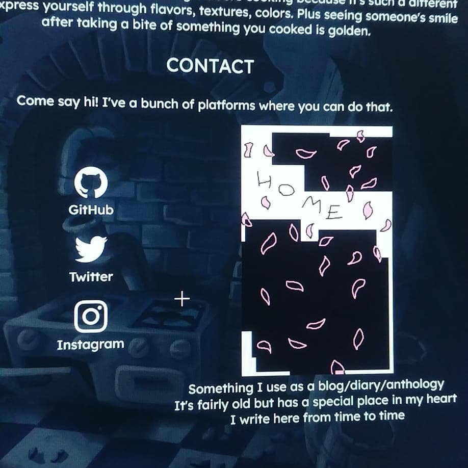
at least i had the heart to keep the orange site around. anyway, things only go up from here
butteredtoast.ml
(september 2019 - february 2020)

up from the ashes, we recover
butteredtoast was fine. with two whole websites of experience behind me i kinda started figuring out how things are done. i made this one a bit more modular and cut all of those shitty restrictive paragraphs of text about me and shit. finally figured out that carving five pages worth of prose about who i am in stone might actually be a bad idea if i want to change my mind on the smallest detail
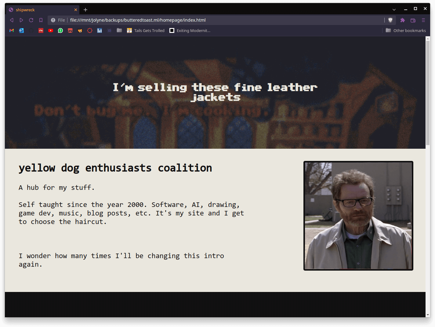
it was alright. not my favorite. there was still some sense of conformity into it. i made this shitty, bootstrapesque section based structure, but i had my fun with it. there were 3 main pages, the homepage, blog and projects pages.
the doorways also make a return, one for the blog page and another for the projects page. making the doorways was fun
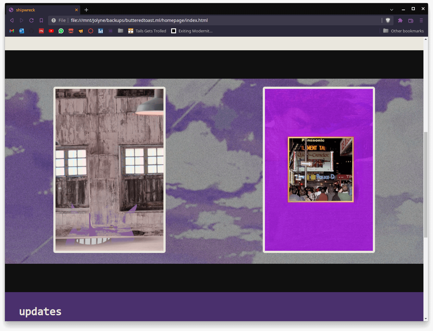
neither page had much on it. im surprised the about page had links to a few other websites i thought were cool, but nothing of interest really. the whole site is fairly boring to go through
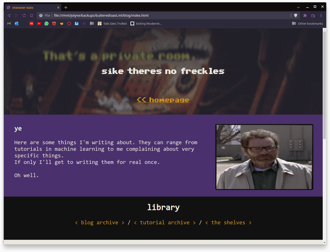
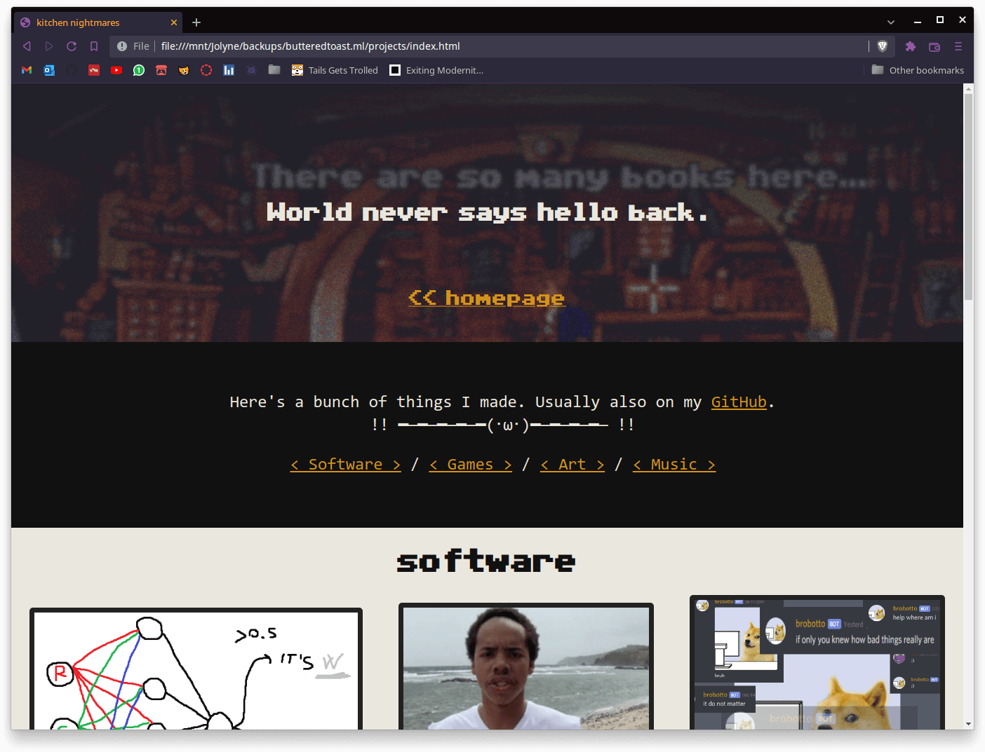

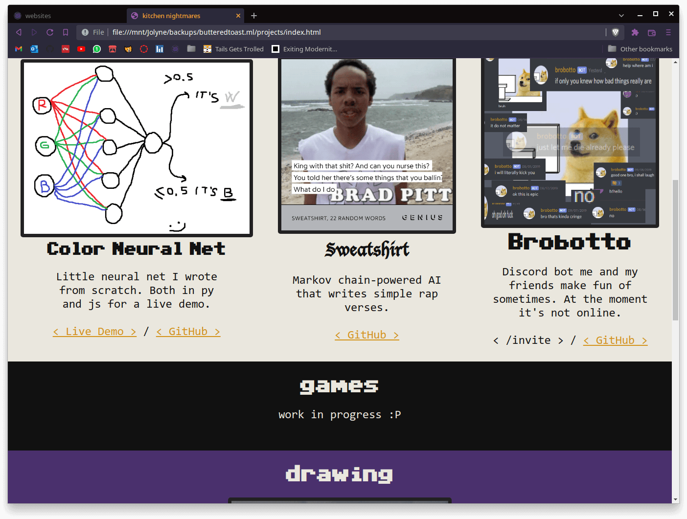
pretty neutral, but a step in the right direction. at least i started using purple. mvrf was also in the files of this site, though no direct path to it. overall i kinda liked it. right now it feels like one of those cheap toys youd get in a bag of corn puffs. the colors look plasticky, the structure is generic, the content is still a bit forced, but its alright. a step up
butteredtoast 2
(february 2020 - april 2021)
wow are you kidding this lasted for more than a year? thats insane

this is where my style was starting to come together. i finally got in the general ballpark of figuring out what i liked, though it was still just a crude start. the "new site demo" link and line underneath are additions made after i uploaded the first draft of freckleskies to neocities, so they werent part of the standard look. thats why they feel so out of place

went for a more minimal approach this time, focusing on quality rather than quantity. probably went too much on the route of cutting things down but its ok how else do you expect to learn
the file archive menu expands when you click on different options. most of them are just direct links to other websites like itch or github, but there are some gallery-like pages for drawings and stuff like that

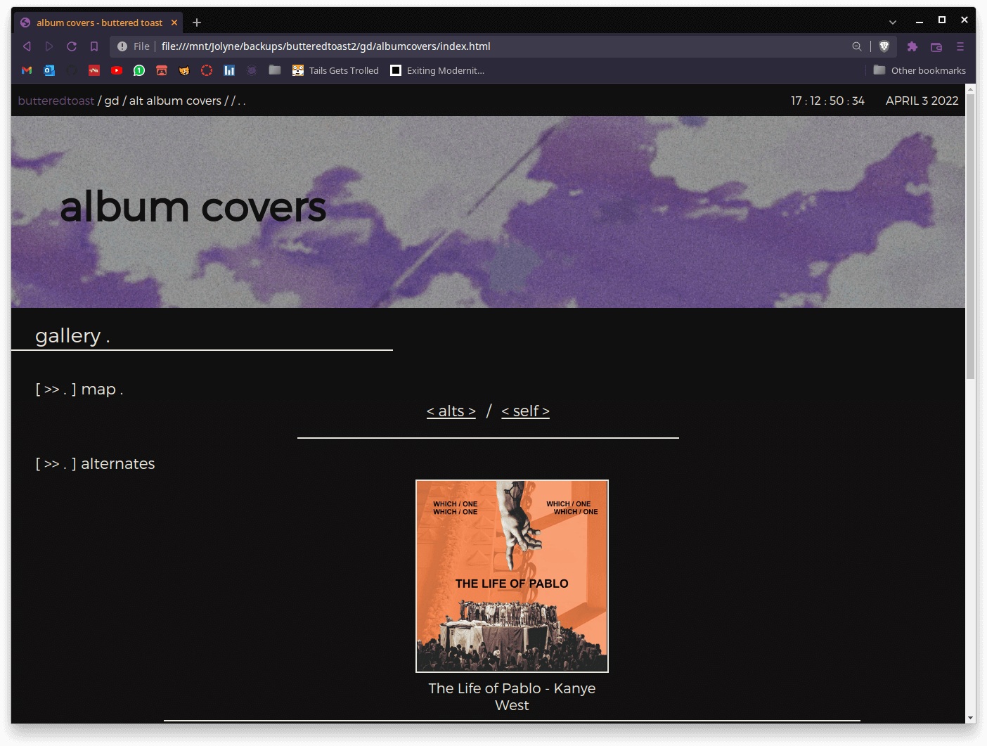
pretty barren and empty but nice overall, solid progression
freckleskies
(3 april 2021)
long gone are the days of github pages and freenom domains
i cant recall how exactly i came accross neocities but im so glad i did. there arent many personal websites out there in the wild and finally coming accross such a huge catalogue of them was nice to say the least
finally moved on from using github pages to host my websites. it did its job but for some reason i never really liked it, even back when i didnt care about how things are done too
i like this site. i genuinely like it
freckleskies.net
(late july/september 2021)
i use .net as a hub of sorts. originally it was meant to tie together a bunch of services i was running on a rpi at home, it just became its own little thing. its self hosted on a little pi3 in my bedroom at home, served with caddy. i like the separation. the neocities one can be the receiver of whatever i want to dump on for the fun of it, while .net can stand aside as a neat little intro or idk what youd call it. sure its a little incomplete as i have some other plans for it as well, but im not in any hurry :)
websites are great. something made by hand, out of nothing, for no real reason other than passion for something. a neat little reflection of their webmasters
it might feel demoralising how many times you hear yourself say "next time/month/website/year i'll do better", but what really only matters is hearing yourself say youre doing better than before
also, has anyone ever tried clicking on that smiley face on the homepage? its been there for a year now